
If there’s one thing we are good at in Northern Ireland, it’s writing stuff on walls. We’ve gathered together some fine examples of this street art and asked Hugo Hamilton – chief critic at Belfast style magazine le Ganche – to interpret these sometimes cryptic works.
Many thanks to all those who contributed images for the gallery. If anyone has any others lurking in their camera feel free to send them to us and we’ll ask Hugo to cast his beardy eye over them.
(For more classic vandalism – visit part two…..)
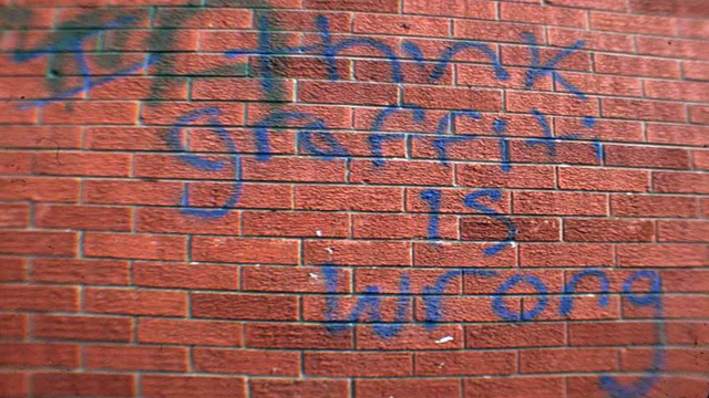
1. Graffiti is wrong
Here we see the work of a tortured artist, torn between his love of graffiti and his inherent sense of right and wrong. He unburdens his soul with a garish blue paint that contrast beautifully with the red brick canvas behind. As a statement, it is simple, but the message it conveys is so complex.
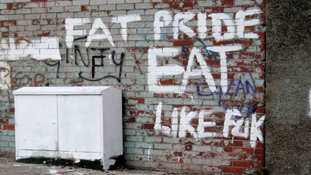
2. Fat Pride
The broad brush strokes of this artist reflect his topic. His message couldn't be clearer, we must revel in our own bodies, fall in love with our fatness, fondle our flab. Note how the word EAT is larger than the rest, as he pleads with us - nay demands of us - to Eat Like Fuk. And yet, he drops a letter from that final word, does he run out of space? Or perhaps he wants us all to "c" what is missing from our lives. A truly magnificent work.
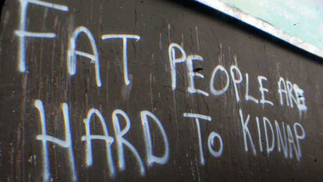
3. Hard to Kidnap
Is this the work of the same artist as the previous offering? If so he has changed his style from brush to spray can, but he returns to the theme of general fatness. Is he really suggesting that Fat People are difficult to kidnap? I think not - they would indeed be harder to fit into the boot of a car, but at the same time would be slower moving. This is not a message to be taken literally - rather it is a metaphor on life - the bigger your soul, the more difficult it is to steal your mind. Or something.
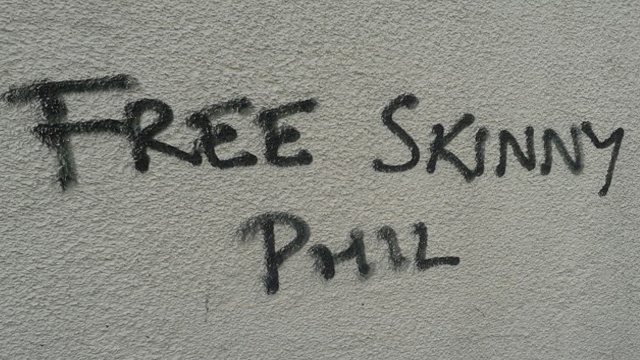
4. Skinny Phil
But what of the Skinny people? Perhaps Phil has failed to follow the advice of the previous two works, and found himself trapped inside his own body image. Who is Phil? He represents us all, and the freedom we crave.
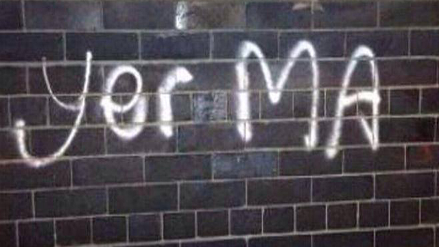
5. Yer Ma
Beautiful in its simplicity - Yer Ma is one of THE iconic sayings of Northern Ireland. As such this work is emblematic of the struggles we face here, and the artist conveys that struggle in hurried letters - lower case for yer, building to capitals for MA. An angry work, and impassioned cry of frustration. Aye, yer ma....
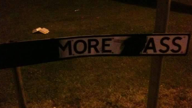
6. More Ass
There is a long artistic tradition of altering road signs, usually to highlight rude words which may lurk within. This example sees Lenamore Pass in Derry/Londonderry shortened to a furtive demand for "More Ass". What is the artist trying to tell us? Is it as simple as a plea for more ass? I think not - the discarded (dropped) takeaway packet in the background, and the removal of the first part of each word, tell me that he is asking for London to be dropped from Londonderry. A political statement - interpreted through Ass.
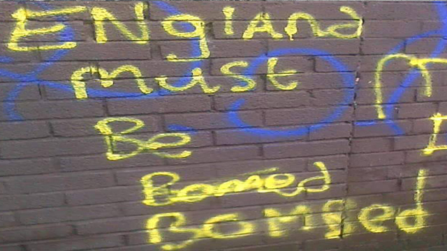
7. Bomb England
At first glance this is another political work, demanding terrorist attacks on England but, as ever, more complex thought processes are on show here. Yellow against brown is a bold statement - but most importantly the word "bombed" is spelled incorrectly. This choice of colour, and the error, reveal that the artist's real target is the English language, and he is telling us that spelling is important. We must be bombed, not bomed, or we are nothing.
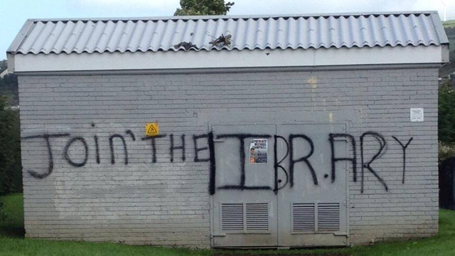
8. Join the Library
Another impassioned plea for literacy, this time on show in Strabane. A political message of hate - Join the IRA - transformed into one of learning - Join the Library. How many young people will heed this call? How many will open their minds to the joys of visiting the local library and wade through the massed ranks of Catherine Cookson novels? We can only hope that it is a lot.
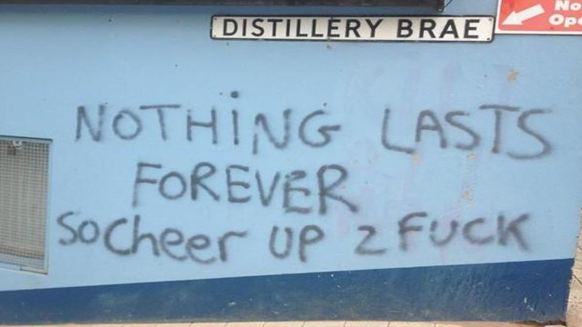
9. Cheer up
Another fine example from the North West. The fleeting nature of life is etched onto the wall, as the artist begs us to cheer up "2 Fuck". In doing so he reminds us that only great art, such as this, lasts forever, and this knowledge should lighten our minds. Why did he choose Distillery Brae for this work? We cannot be sure, but I'd imagine the link to alcohol and transient happiness was lurking at the back of his mind.
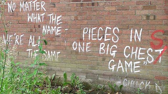
10. Big Chest
To finish, we have a quote from Public Enemy's Chuck D, telling us that we're all "pieces in one big chess game". The artist writes beautifully using well formed capitals, and remembering the apostrophe in "we're"- but what is this at the end? A spelling mistake that makes us all pawns in a game of "Chest". Such perfection in form, leading to such a simple, supposed error tells us that the painter did this on purpose, inviting the correction from a fellow artist. This eventually comes in the form of a bright red letter S - but at the same time shows us that the artist feels that we're not all the same, some of us have big chests.